40 Maps That Explain Food In America
Chris Brunner, June 17, 2014
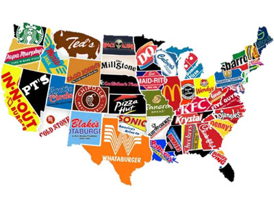 How nations feed themselves is getting more complicated. Fewer people are working in agriculture now, we keep losing farms, but America keeps growing more food. Farmer’s markets are springing up everywhere and the opening of fast food chains isn’t slowing down. Yet even with the diversity of choice, food insecurity coexists with an obesity crisis. Learn where our food comes from and how we eat it on the California Department of Food and Agriculture’s 40 maps that explain food in America. The maps, charts, and graphs supply an assortment of information about our food supply varying from which crops are harvested where, to a map that lets you watch corn eat sunlight from space.